100 Days of UI Design (DailyUI Challenge): A Journey Review
It’s been a great journey for me as I completed a 100-day challenge to improve my UI design skills. I’m happy with what I’ve accomplished and all the new things I’ve learned along the way. The experience has been truly amazing & helpful.
This article showcases my 100-day journey in design, featuring my growth and progress from the start to the end of the challenge.
Cover Image

Day 01
Day 02
Day 03
I don’t like this design now, the color contrast in the design is not upto the mark
Day 04
Day 05
Notes app Icon redesigned
Day 06
Day 07
The user setting is pretty basic
Day 08
Day 09
Music app redesign
Day 10
Social share in mobile app
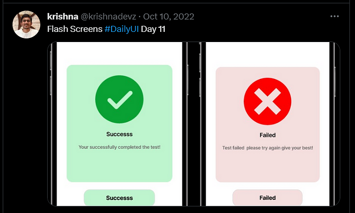
Day 11

Day 12
E-Commerce shoe app — single item
Day 13
Day 14
Day 15
Day 16
Day 17
Day 18
Day 19
LeaderBoard Design
Day 20
Location Tracker
Day 21
Day 22
Day 23
Day 24
Day 25
Day 26
Day 27
Day 28
Day 29
Day 30
This is a bad design but now I am showing progress here so I didn’t do any changes to it check my Breath mental health app UX & UI case study in that I updated pricing according to current design standards.
Day 31
Day 32
Day 33
Day 34
Day 35
Day 36
Day 37
Day 38
https://www.figma.com/community/file/1174667179441649385
Day 39
Day 40
Day 41
Day 42
Day 43
Day 44
Day 45
here again, color contrast doesn’t look fine :|
Day 46
Day 47
Day 48
Day 49
Day 50
Day 51
Day 52
Day 53
Nav bar Design
Day 54
Day 55
Day 56
Day 57
Day 58
Day 59
Day 60
Day 61
Day 62
Day 63
Day 64
Day 65
Day 66
Day 67
Day 68
Day 69
Day 70
Day 71
Day 72
Day 73
Concept Design
Day 74
Day 75
Day 76
Day 77
Day 78
Day 79
Day 80
Day 81
Day 82
Day 83
Day 84
Day 85
Day 86
Day 87
Day 88
Day 89
Day 90
Day 91
Day 92
Day 93
Day 94
Day 95
Day 96
Day 97
Day 98
Day 99
Day 100

Thank you for taking the time to check out my progress with dailyUI. I know I still have room to improve, but I feel like I’m in a better place now than I was before. I believe that we should always work on becoming a better version of ourselves, and that’s what life is all about. I’m going to keep doing things I love and keep improving.
Note:- Please take a look at my portfolio & projects if you are hiring for positions in UX Research or UX & UI Design
Portfolio Link :- https://lnkd.in/g-rv7zCy
Happy to Connect ❤
- On my Instagram, you’ll find a collection of visual storytelling, including photographs, short films, and written musings, all centered around exploring and expressing my emotions and personal experiences. @krishnadevz , Let me know what do you think about it? and want to collaborate on some photography projects. I can be reached at krishnakakade77@gmail.com.
- Glad to connect on a so-called professional networking site Linkedin.
- Thoughts & User Interface / User Experience work dumping on Twitter.
- Sometimes I make videos on Youtube related to UX Research & Design and also film some stuff.
Thank you so much for reading wishing you the best day ahead!
