Heuristic Evaluation Analysis: Comparing Amazon and Flipkart👁️
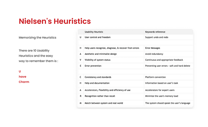
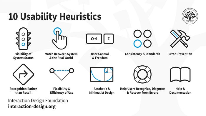
Hello Everyone
In this UX design article, we will evaluate the user interface and user experience of Amazon and Flipkart through heuristic analysis. By doing so, we will identify the strengths and weaknesses of both platforms, providing practical examples of how to apply heuristic evaluation to real-world platforms.
H: Help users recognize, diagnose & recover from errors in the amazon website & app Error Messages
All the form fields show messages telling you if you have entered incorrect information.
In amazon app also follows H heuristics (i tried including screenshots from amazon’s app through android but it doesn’t allow screenshots).
App also works the same and it passed this test.


In Flipkart Website
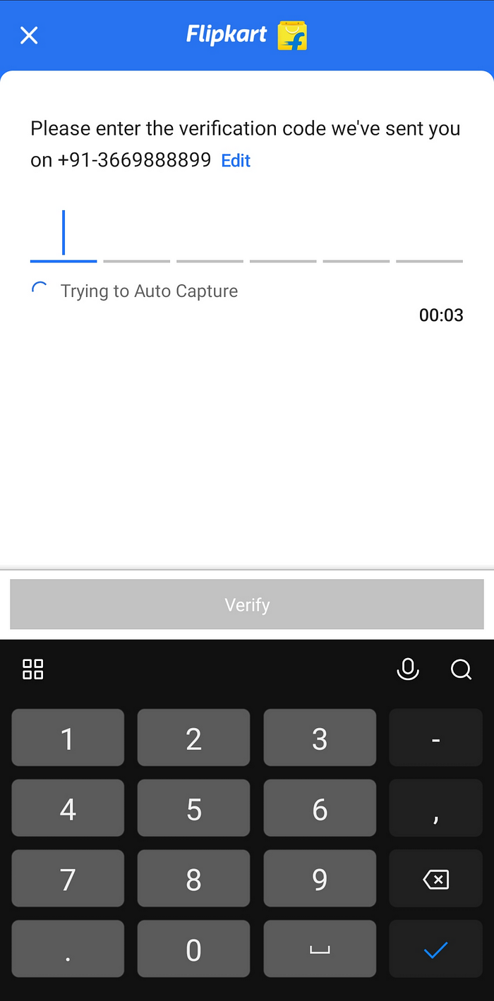
All the form fields show messages telling you if you have entered incorrect information.


In Flipkart App
All the form fields show messages telling you if you have entered incorrect information.
It is not working properly because even if we entered wrong number still it is showing OTP is sent to the number.

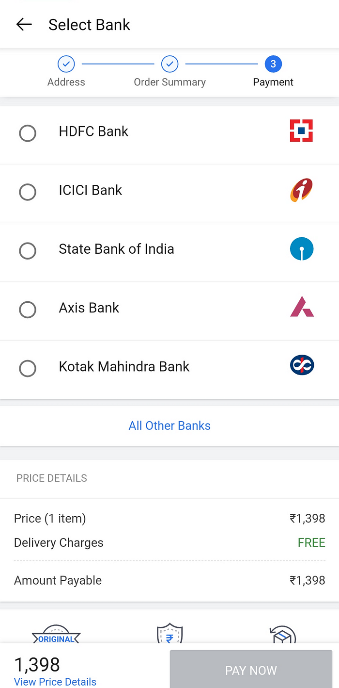
U : User Control & Freedom (Support Undo and Redo)
Problem: There is no option to go back or exit while placing an order. However, you can use the “backward icon” in your browser to go back.

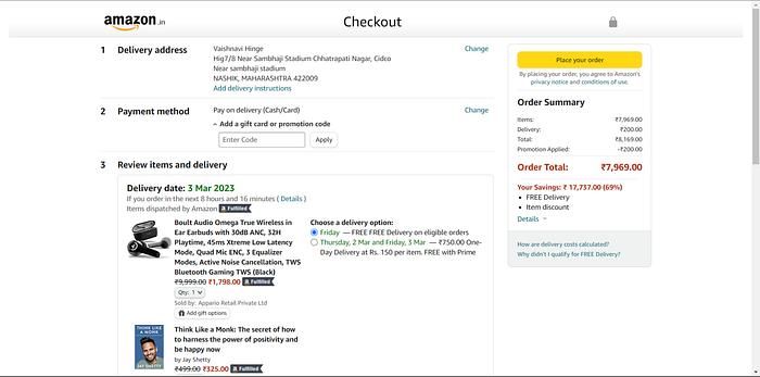
In amazon app
After logging IN amazon app screenshots is allowed There is back arrow to go back so passed the test.


Flipkart
U : User Control & Freedom (Support Undo and Redo)
Problem: There is no option to go back or exit while placing an order. However, you can use the “backward icon” in your browser to go back.


In Flipkart app
There is back arrow to go back so passed the test.
Amazon
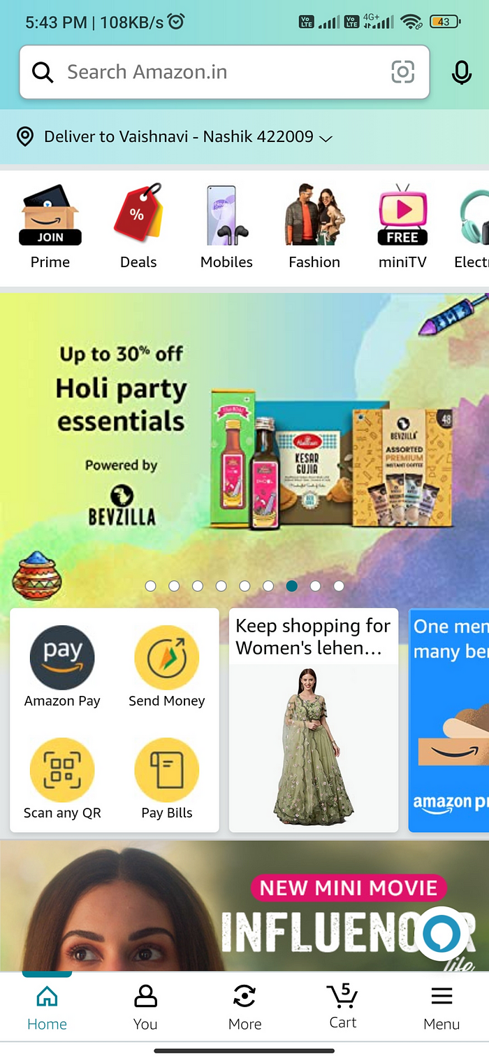
A : Aesthetic and Minimalistic Design (Avoid Redundancy)
Amazon’s website looks simple and easy to use, but it’s actually a complicated platform. If you’re not good with technology, it might be hard to figure out. However, Amazon uses bright colors to highlight important things like buttons you need to click, items that are on sale, and whether or not something is in stock. This makes it easier for users to navigate the site and find what they need. but ads and other widgets breaks consistency.


In amazon app

Flipkart
A : Aesthetic and Minimalistic Design (Avoid Redundancy)
Simple and easy to understand. but ads and other widgets breaks consistency.


In Flipkart app


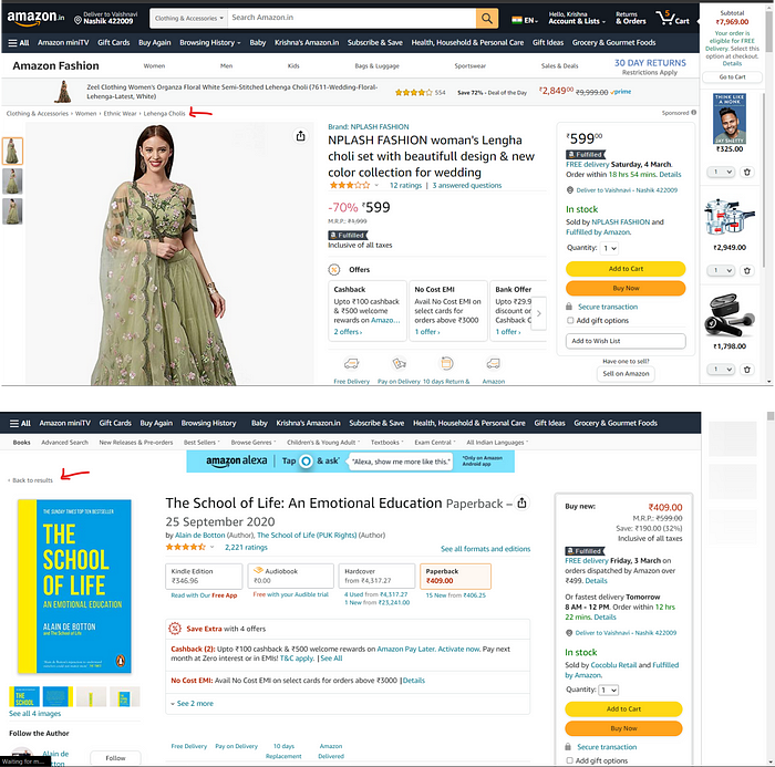
V : Visibility of system status : Continuous and appropriate feedback
For example, if someone is looking for a product, we can use breadcrumbs to show them the path they took to get there, like “Home > Product Category > Product Sub-Category > Product”.
This helps users keep track of where they are on the site and makes it easier for them to navigate back to previous pages if needed it should be highlighted properly.

In amazon app


Flipkart
V : Visibility of system status : Continuous and appropriate feedback
For example, if someone is looking for a product, we can use breadcrumbs to show them the path they took to get there, like “Home > Product Category > Product Sub-Category > Product”.
This helps users keep track of where they are on the site and makes it easier for them to navigate back to previous pages if needed it should be highlighted properly.


In flipkart app


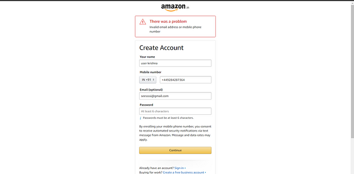
E: Error Prevention: Hard and soft delete
To help users avoid mistakes when filling out forms, we can provide placeholder text that shows what information is needed.
If an error does occur, it’s important to show the error message right away so users can correct it.
By doing this, we can make the form-filling & account-creation process easier and more efficient for users.

In amazon app
To help users avoid mistakes when filling out forms, we can provide placeholder text that shows what information is needed.
If an error does occur, it’s important to show the error message right away so users can correct it.
By doing this, we can make the form-filling & account-creation process easier and more efficient for users.

Flipkart
E: Error Prevention: Hard and soft delete
To help users avoid mistakes when filling out forms, we can provide placeholder text that shows what information is needed.
If an error does occur, it’s important to show the error message right away so users can correct it.
By doing this, we can make the form-filling & account-creation process easier and more efficient for users.

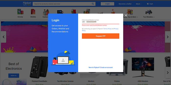
In Flipkart app

C: Consistency and Standards: Platform Convention
To ensure consistency in design elements like the color scheme and CTA’s. Inconsistencies can lead to confusion and frustration for users, making it difficult for them to understand how to interact with your product.
By maintaining a consistent design language, we can create a better user experience that’s both intuitive and easy to use.

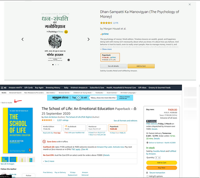
In amazon app

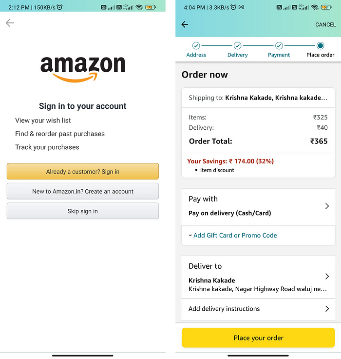
Flipkart
C: Consistency and Standards: Platform Convention
To ensure consistency in design elements like the color scheme and CTA’s. Inconsistencies can lead to confusion and frustration for users, making it difficult for them to understand how to interact with your product.
By maintaining a consistent design language, we can create a better user experience that’s both intuitive and easy to use.


There are still some places where CTA’s are inconsistent but there is a different context of use.

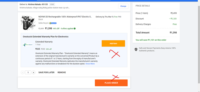
Flipkart app


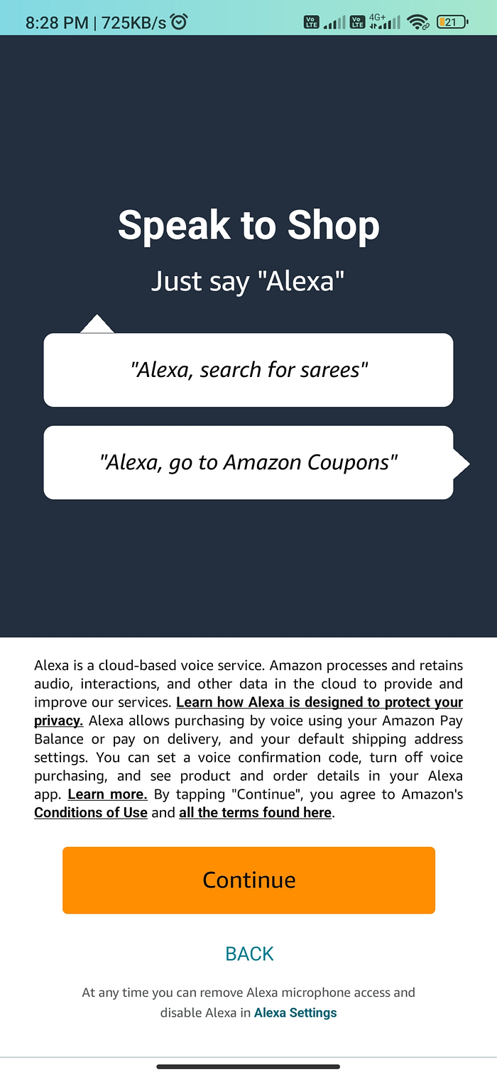
H: Help & Documentation: Information for users tasks


In amazon app

Flipkart App
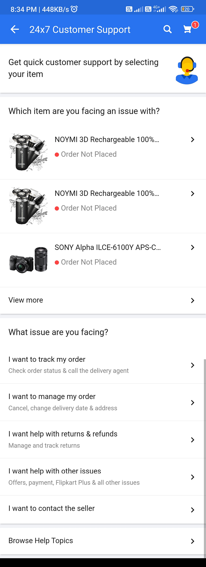
H: Help & Documentation: Information for users tasks


In Flipkart app

A: Accelerators, Flexibility, and efficiency of use
Easy to use app for new and expert users and simple.

In amazon app

Flipkart app
A: Accelerators, Flexibility, and efficiency of use
Easy to use app for new and expert users and simple.

In amazon app

R: Recognition rather than recall
We get recommended recently viewed products and things we see on the website.

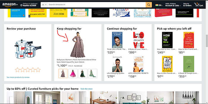
In amazon app


Flipkart app
We get recommended recently viewed products and things we see on the website.

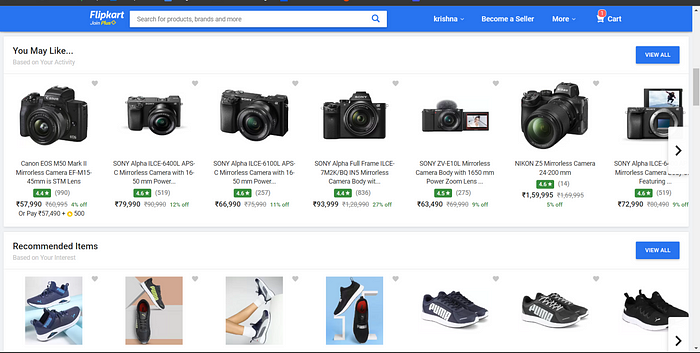
In Flipkart app


M: Match between system and real world
Real-world UI Icons used without any explanation users can know what’s the meaning or use.


In amazon app

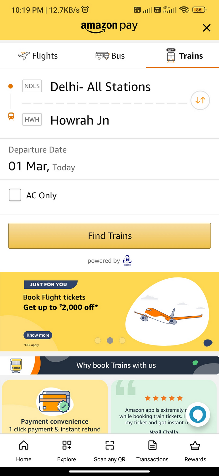
M: Match between system and real world
Real-world UI Icons used without any explanation users can know what’s the meaning or use.


In Flipkart app


Comparison summary
After conducting a heuristic evaluation of Amazon and Flipkart’s website and app, it was found that Flipkart has a better user interface design. Their UI is consistent and well-maintained, with clear Call-to-Action (CTA) buttons. On the other hand, Amazon showed some inconsistency in their CTA & overall UI.
However, Amazon outperformed Flipkart in recommending personalized content. According to user reviews, Amazon’s recommendations are accurate and up-to-date compared to Flipkart’s.
When it comes to user experience, Amazon takes the lead. The platform requires fewer clicks to complete tasks, resulting in a simple and easy-to-use experience. In contrast, Flipkart’s multiple clicks can make the user experience more complicated(more clicks more time in the homepage nav bar on the amazon website all categories are shown there with one click we can do things but in case of Flipkart we to go through the multiple dropdowns and clicks).
In conclusion, while Flipkart has a better user interface and consistent spacing CTA’s, Amazon offers a superior user experience.
Thank you so much for reading and if you have any feedback please let me know in the comments.
Note:- Please take a look at my portfolio & projects if you are hiring for positions in UX Research or UX & UI Design
Portfolio Link :- https://lnkd.in/g-rv7zCy
Happy to Connect ❤
- On my Instagram, you’ll find a collection of visual storytelling, including photographs, short films, and written musings, all centered around exploring and expressing my emotions and personal experiences. @krishnadevz , Let me know what do you think about it? and want to collaborate on some photography projects. I can be reached at krishnakakade77@gmail.com.
- Glad to connect on a so-called professional networking site Linkedin.
- Thoughts & User Interface / User Experience work dumping on Twitter.
- Sometimes I make videos on Youtube related to UX Research & Design and also film some stuff.
Thank you so much for reading wishing you the best day ahead!
